Hello! The Pantone color of the Year for 2017 was recently announced. For those who are unfamiliar with Pantone it is a global organization that provides a collection of colors that can be used consistently throughout the world.
Each year Pantone makes a prediction of what color will trend or take precedence in fashion and design that year.
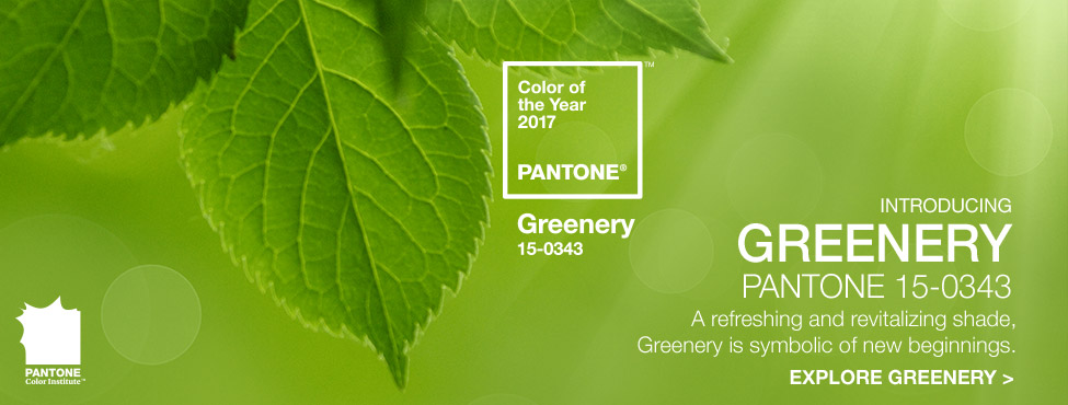
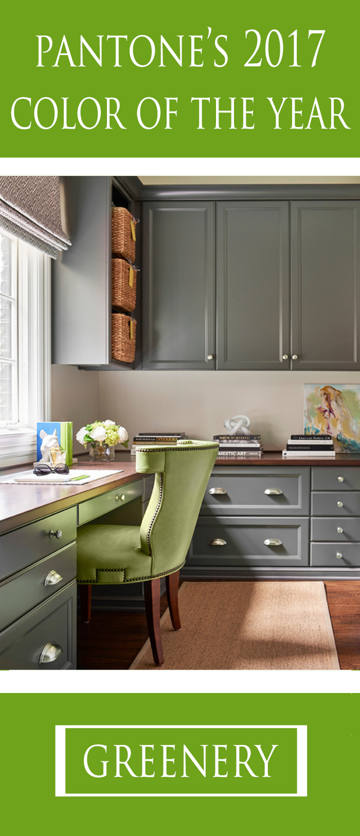
Greenery was chosen as Pantone’s 2017 color of the year.
I was a little surprised by the choice (not that I’m saying that it was a bad choice).
One reason being that just last month Benjamin Moore announced their 2017 prediction to be Shadow. Shadow and Greenery seem like practical opposites–one being moody and mysterious and the other hopeful and energetic (although they do balance each other out well).
The other reason I was surprised is that Greenery seems like a very classic, timeless color. In the past Pantone has chosen colors that are perhaps less commonly used and that may be trendy for a few years or a decade and then fade out but to me greenery seems like an every day, year, decade, centennial color.
But maybe that’s just my perception…what do you think?
Here are some of my favorite ways to decorate with Greenery.
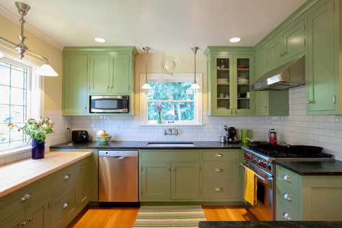
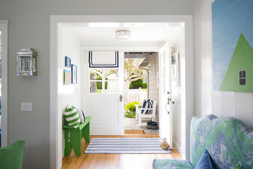
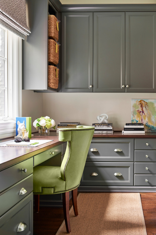
It looks striking paired with black and white!
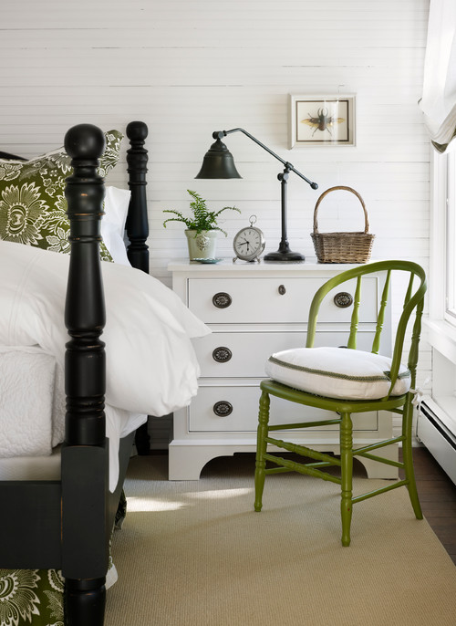
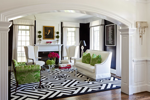
via Houzz
S2 Builders via Houzz
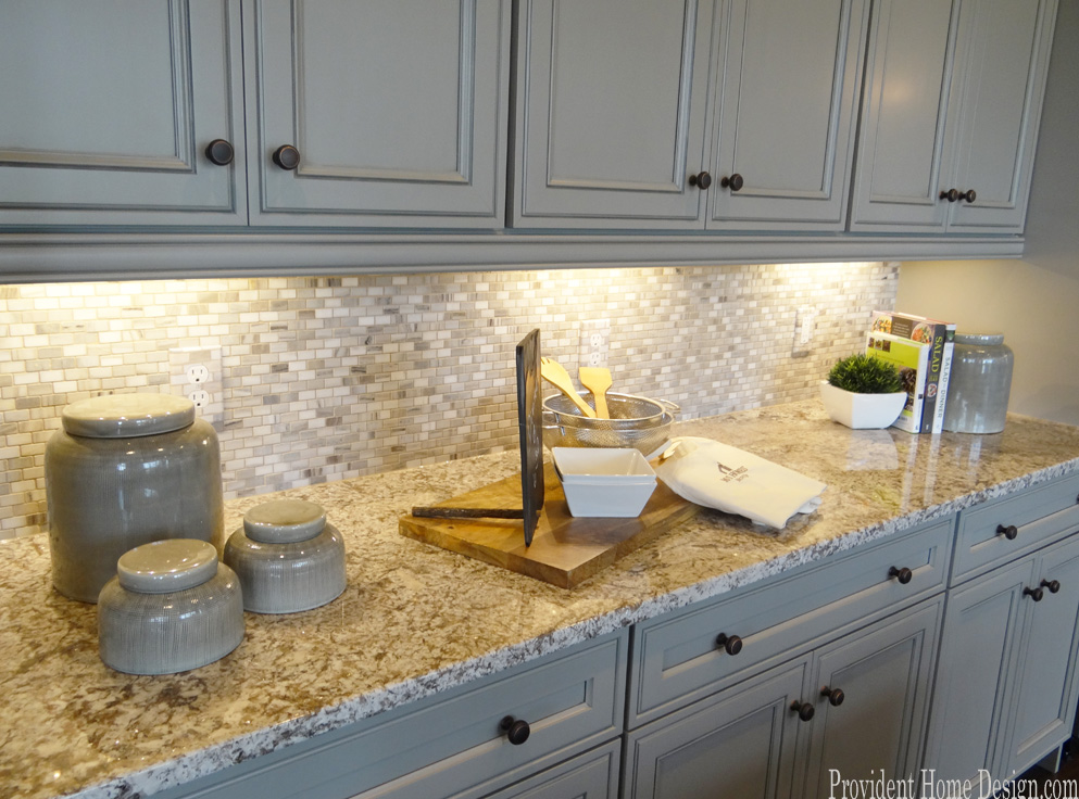
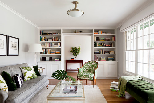
It also pairs well with both gray and beige.
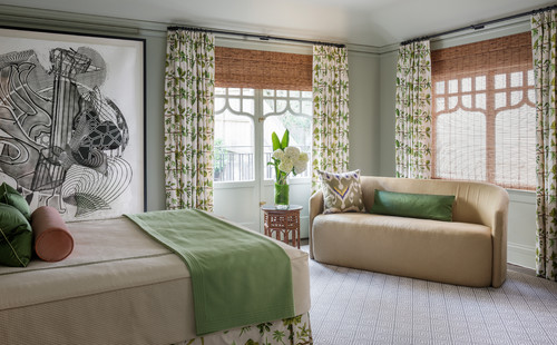
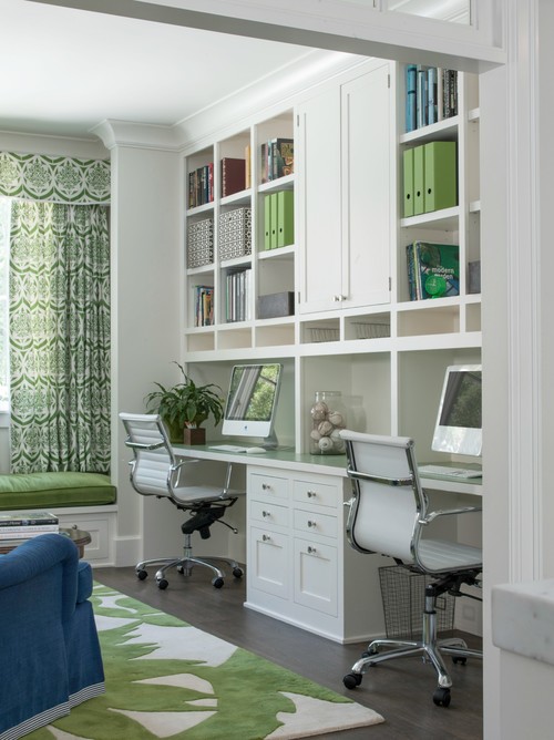
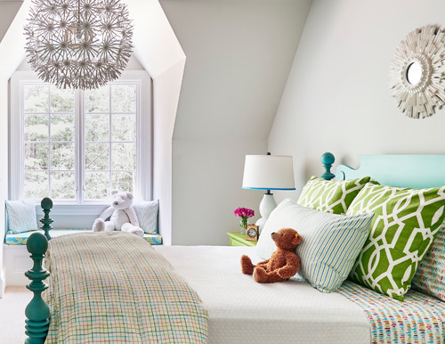
It’s a natural companion to blue. For a softer look pair it with soft blues.
Bowley Builders via Houzz
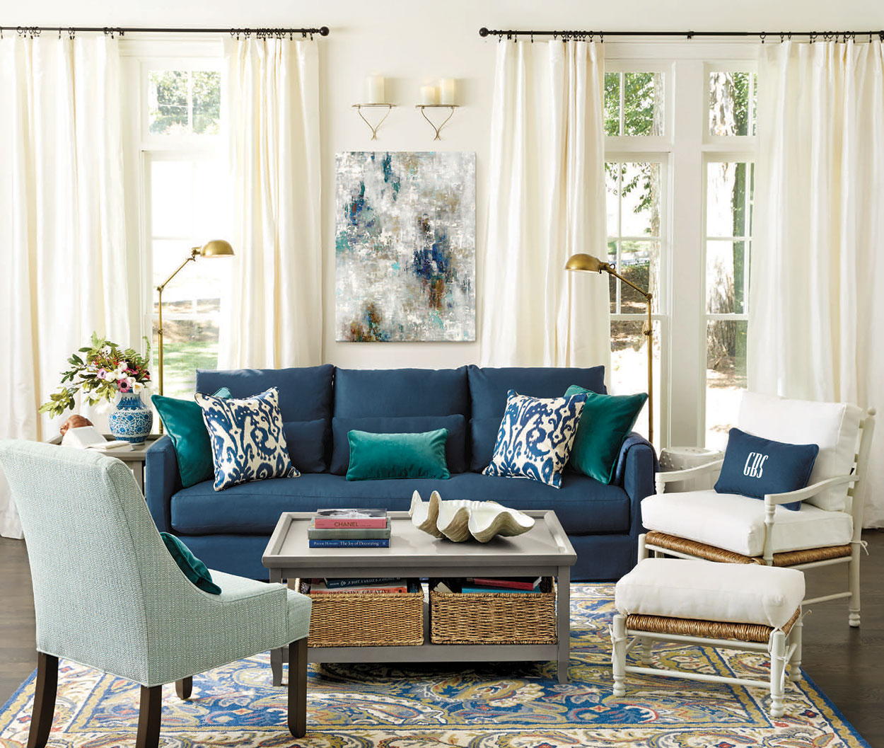
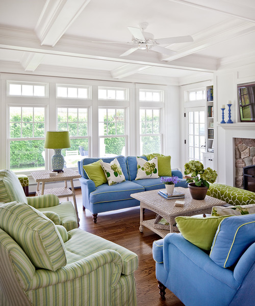
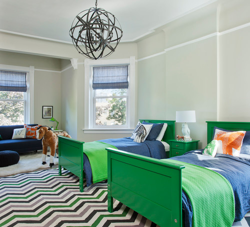
Want a more bold look add navy to the mix.
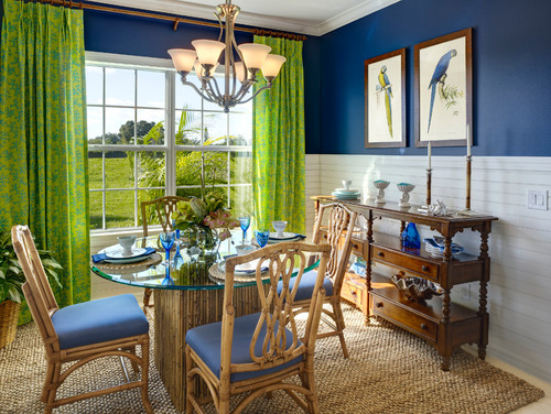
via Houzz
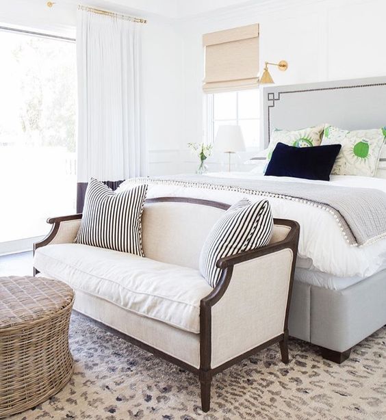
And for a more care-free, fun-loving vibe pair it with turquoise.
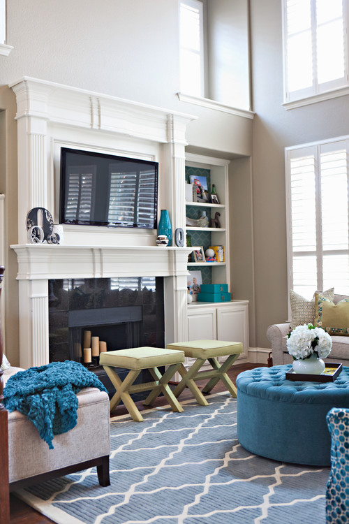
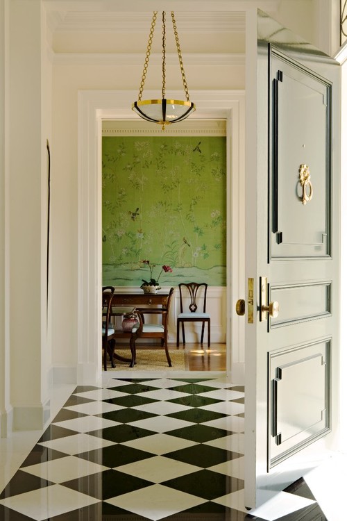
If you love monotone rooms but sometimes just need a little hint of another color Greenery would be a perfect go-to selection.
And don’t forget you can use plants to incorporate the color Greenery (I talk all about how to do this HERE).
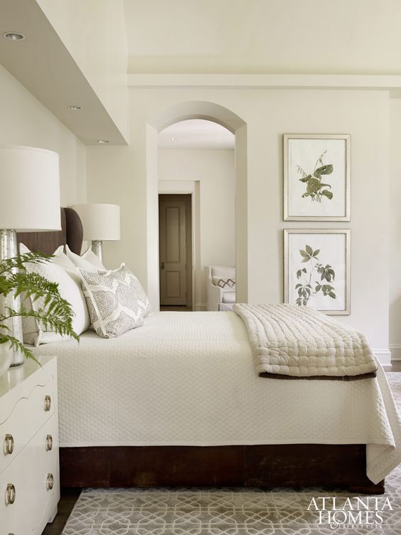
via Atlanta Homes
We are so used to seeing this color in nature (grass, trees, plants) that when we come across it we don’t think twice about it because it’s familiar.
Home Design & Decor Magazine via Houzz
Usually I say repeat a color at least two or three times in a room for it to feel cohesive but when it comes to Pantones’s Greenery you can use it just once (that’s how conditioned we are to the color plus there’s a good chance the bushes and trees outside the window in the room will tie it together as well).
via Studio Mcgee
So what do you think about Pantone’s color of the year prediction for 2017? Do you have any strong feelings about it? Love or hate it?
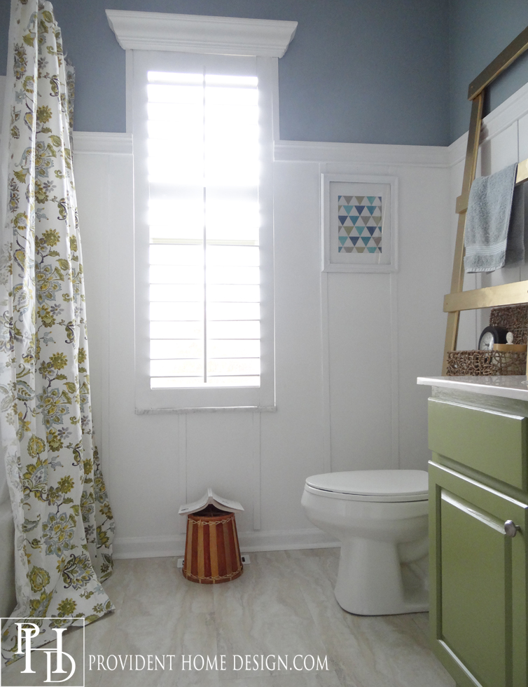
I like it for a pop of color from time to time in my home decor accents (like in our kid’s bathroom where I painted the cabinetry green).
But I wouldn’t paint a whole room in my home Greenery because I’m drawn to calm, peaceful rooms and a whole room painted in greenery would be too much energy for me personally.
What do you think about the color?
Hope you have a great weekend!!:-)

Related Posts From the Blog:
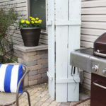 The Trick to Hiding your Outdoor Uglies
 How to Paint a Gray Weathered Finish on Furniture
 Blue & White Striped Vase and a Sneak Peek
 The Trick to Growing Grass & Porch Update
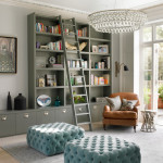 Design 101-Masculine vs. Feminine
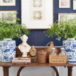 Navy & White You Feel So Right
 DIY Ballard Designs Inspired Ottoman/Stool
 Design 101-Symmetrical & Asymmetrical Balance