Last month in Design 101 we discussed how repeating similar colors throughout the home helps create a home that has a nice sense of flow and cohesiveness. The principle of repeating colors also pertains to decorating a room. If you use a color once in a room be sure to use it at least one or two more times in other areas of the room. Repetition in design is crucial to creating rooms that are cohesive and satisfactory to the eye.
Today we will be talking about the repetition of patterns in creating beautiful spaces in your home. The use of patterns in your rooms promotes interest and personality! Imagine a room that only had furniture and décor that were solid colors, absolutely no prints or patterns. It would be pretty plain and less welcoming.
There are a vast amount of patterns out there! Some include Stripes, Florals, Polka Dots, Herringbone, Geometric, Ikat, and the list goes on and on. It is important to utilize pattern in decorating your home and to repeat patterns in a space.
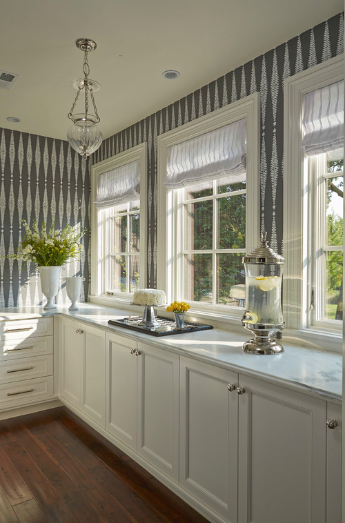
I find that the most attractive spaces have one main pattern carried out throughout the room with one or two other patterns that take more of a back seat position. Here are some great examples from professional interior designers. Study the picture and see if you can pick up on the main pattern being employed.
I LOVE the space above. It is so pretty and tranquil. The pattern I see repeated throughout the room is stripes. Most noticeably on the wallpaper, then on the window treatments, and then again on the glass part of the light fixture. This recurrence of stripes is subtle but powerful in creating such a beautiful, cohesive room.
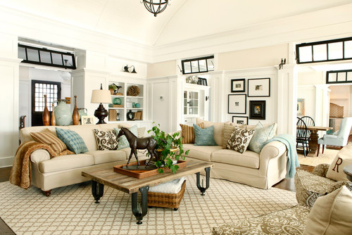
Again I LOVE the space above. It is inviting, interesting, and relaxing. Do you see the recurring pattern??? Yep, it is squares or boxes and it is mimicked several times throughout the room. On the rug, the pillows are a square shape, square matted frames on the wall, the unique square patterned entry way frames in black, the black door has a glass grid square pattern, and even the light fixture has a grid pattern.
I also like how the patterns on the pillows embrace two other secondary patterns to the space, stripes and Ikat.
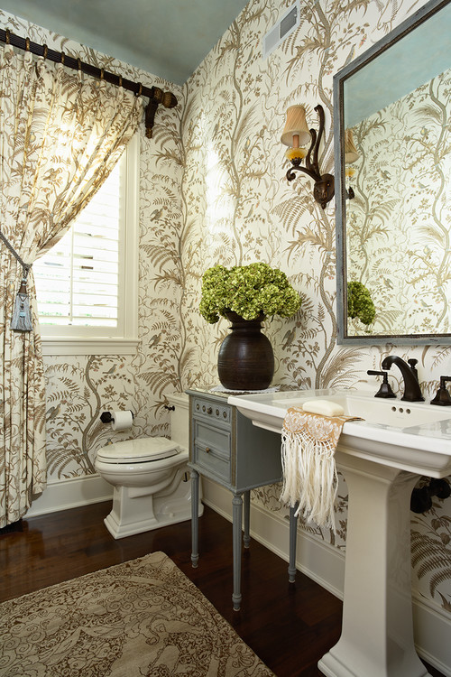
The bathroom above is fun and different but unified due to it’s use of repetition in both color and pattern. I do not know the technical name of the pattern exercised in this room but I call it scroll. It is a pattern with soft curves that branch out in varying directions. I see a scroll pattern in the wall paper, in the drapery, in the sconce, in the hand towel, and in the rug.
To be honest I’m not a big fan in the pattern play orchestrated in the photo above. There is good use of repetition of color but to me the space reads chaotic as the patterns vary too much and there is not one main pattern with secondary patterns. To me it feels like all the different patterns are all fighting for attention in this space. They did go above and beyond in repeating the dog pattern though:-)–cute little doggies.
So how can you implement this design principle into your own spaces? Well, if your like me I usually decorate a space a little at a time. I may start out with some items already there, like a ceiling light, some furniture, and piece of art but I gradually add more accents and accessories into the space. As you do this you can be aware of any patterns you have going on already in the space and you can be sure to add pieces that will advance a main pattern and one or two ‘backseat’ patterns.
For example, in the bathroom below I assume that the light fixture was chosen first. The designer then chose a bath mat that mimicked the shape or pattern of the light fixture. When deciding on a decorative accessory for the window next to the oval bathtub they chose a ceramic urn/jar that’s body also has an oval-like shape like the light fitxure, bath mat pattern, and bathtub.
The wonderful thing about decorating is that it is a visual, creative process. I don’t like rules when it comes to creativity but if you are like me sometimes it is beneficial to have some underlining guiding points to help me when I am stuck. That is what these Design 101 tips are meant for–please use them as helps but don’t let them take the fun out of creating your home in your special way! For more of my Design 101 tips click
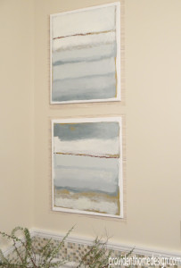
Here. I’ll be back soon with a tutorial on how I DIY-ed these paintings.
.



I love that your broke down the many thoughts that go into creating a space. I think I consider these things but sometimes I need to be reminded of them. Thank you for the examples. You can see a difference. Of course it is all up to personal taste but you don’t want to be the only one in love with your home while everyone else cringes. A good balance is needed
You’re welcome, Emily! Yes, definitely a good balance is the goal. I appreciate your
comment!:-)
I really appreciate the way you broke this down for those of us who aren’t designers by nature. I’m in the process of redecorating my family room and have been having a dickens of a time picking fabric for throw pillows. After reading this, I realized that I have two elements with stripes already, so I guess I should look for patterns with a play on stripes.as I move forward. Thanks for the tips!
Found you at Tip Me Tuesday!
Kim, I’m so glad you found it helpful! Thanks so much for stopping by!!!:-)
Thanks for the tips! Like Kim above, I am not a designer by nature and I need things broken down. I will look at a room and know that I like it, but not know how to recreate it. This has given me some great ideas for the house that I will be moving into in a few weeks.
Thanks again, visiting you from Thrifty Thursday. 🙂
Ashley @ LeavingTheRut.com
I’m so glad you found this helpful, Ashley! Sounds like the next couple weeks will be a busy, exciting time!!! Thanks for stopping by!:-)