Hello, I hope you’ve had a good week! This week it’s been Spring Break for the kids and we’ve been able to get some much needed garage cleaning and yard work done, which has been nice!
I’m excited to tell you that I have also been working on compiling all my Design 101 posts into an easy to read 12 chapter ebook. Once it is ready I will be sharing it for free with all of my email subscribers as a way of saying thank you!!
Today I thought it would be fun to test the skills you’ve been learning in these Design 101 posts with a little “Why it Works” post.
I will be sharing photos of some rooms that I love and we will discuss why the room works or in other words what design principles were played out to make the space cohesive and pleasing to the eye. So, let’s begin!
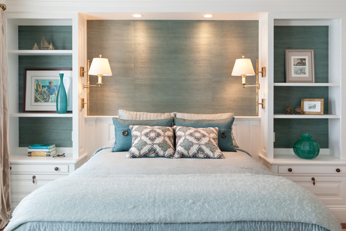
- A casual, elegant bedroom.
I think the most obvious design principle in this space is the use of color repetition. A teal or turquoise color can be observed through the space (wall covering, vases, pillows, and bedding) giving the space a feeling of continuity.
Additionally the repetition of patterns/shapes also increase a cohesive feel in this bedroom. Square and rectangle shapes are presented in the wall space between and within the bookshelves, the frames, the pillows, and the bed.
Circular shapes are shown in the lampshades, vases, and knobs.
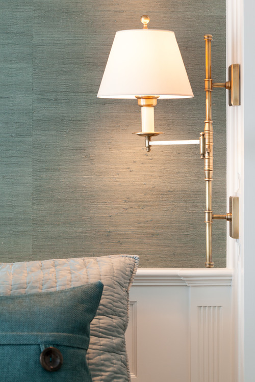
The repetition of linear lines can be seen in this close up (in the grass cloth wallpaper, decorative molding, the vertical line on the light fixture. even the threading on the back pillow).
Have you heard the phrase “design is in the details”? The attention to detail is truly what sets a well designed, thought out space from the rest and this room exemplifies how well the designer included repetition into even the minute details of the room.
Turquoise is a cool color. What elements in the room balance it with warm colors or finishes? The gold in the sconces, the wood frames, and the drapes look like a tan color (or a very warm gray or taupe).
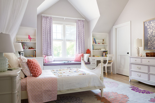
2. A pretty, girls bedroom.
Isn’t this girls room picturesque? I get the feeling that the rug was the jumping off point for this room. The pink (and varying shades) are found in the bedding, pillows on the bed and window seat,the bird silhouette and other knick knacks adorning the desk hutches.
For practice I’ll let you find where the designer displayed the purple shades throughout the room.
Also notice how a flower pattern is repeated in the rug, white bedding, and in the wall art and geometric shapes can be found in the window treatments and a couple of pillows.
In both of these bedrooms layering is beautifully executed! If you scan the rooms with your eye from left to right and then from top to bottom you will find no awkward empty spaces.
In both bedrooms there is a sense of balance in visual weight. In the first bedroom there is a lot of symmetrical balance going on where as the second bedroom asymmetrical balance is reigns.
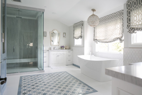
3. A serene master bathroom.
This is another beautifully orchestrated space. The colors and patterns relate well to one another. I have to be honest though although the hanging light fixture over the bathtub is beautiful I feel like there needs to be another circular element in the room for it to make sense. My eye wants a different shaped light fixture there. Anybody else?
As far as layering goes the eye moves around the space easily, there are no awkward empty spaces. Imagine if the floor was all white instead of having a design feature. It would be a sea of white and perhaps a bit boring to the eye.
With the balance of boxy and rounded elements the room feels both masculine and feminine. The softness of roman shades give a more feminine vibe where as the darkness and shape of the floor tile feature brings in the masculinity.
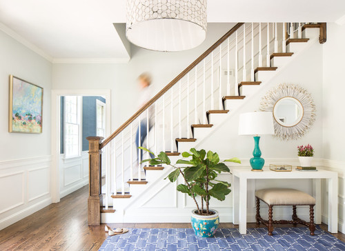
4. A comfortable foyer.
This hallway and the living room below both have 3 main color ways repeated throughout the space. What do you think they are? Yep, turquoise, blue, and off-white. Look at each picture and see where the designer repeated these colors and any other colors used.
In the foyer you can see a nice balance of circular and boxy items. The circular items are the mirror, vase on the desk and floor, and the drum shade of the lamp and ceiling fixture. Boxed items are the rug, the wall art, the wainscoting, the windows, the desk and the stool.
Test yourself and see if you can identify which elements promote a balance of warm and cool colors.
5. A cozy, cohesive living room.
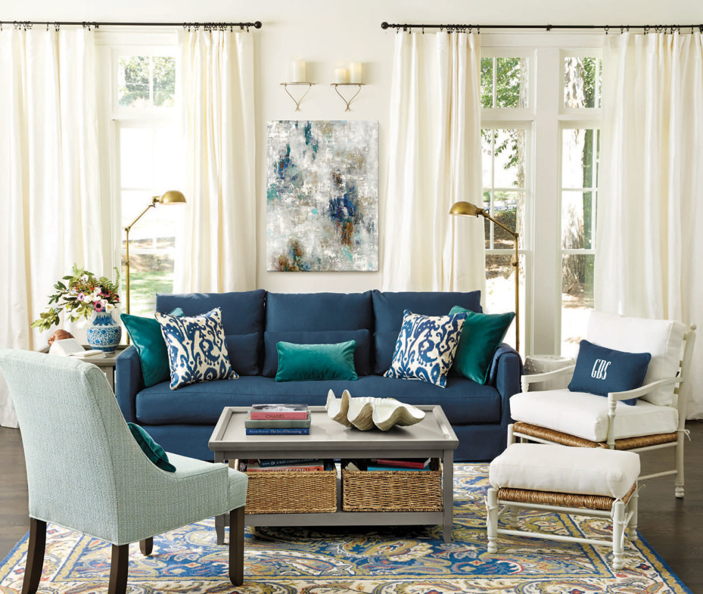
via Ballard Designs
This last room I’m going let you tell me (or more like yourself):-) the answers to the following questions:
What patterns or shapes do you see repeated and where?
Is the room symmetrically balanced or asymmetrically balanced and how?
What are the warm colors that balance out the cool colors?
Which elements in the room are more feminine and which are more masculine?
What is the focal point of the room?
Were “antiques” or heirlooms used in the room to add interest and tell a story?
Do you think that if all the rooms above were in the same house that the home would have good aesthetic flow?
These are all questions that if you can’t confidently answer now you will be able to after reading my free ebook coming soon!
If you aren’t already signed up to receive email notification of my weekly posts and you want to make sure you get the ebook you can subscribe by email here (I will never share your email with anyone).
[jetpack_subscription_form]
I hope you enjoyed this Design 101 post. As always let me know if you have any questions! I will be back next week with a DIY. I hope you have a great weekend!!

Related Posts From the Blog:

 Color Quiz- Fun & Informative
 BIA Parade of Homes Preview & What’s Trending Right Now
 My Christmas Home Tour & More
 Our Media Room Makeover Reveal
 The Before of our New Home!
 The Easiest Way to Add Brick to Your Home
 Design 101- 8 Tips to Becoming a Bookshelf Styling Pro
 3 Elements of a Stylish Kids Bathroom