Each year one of the country’s leading manufacturers of paint, Benjamin Moore, chooses one paint color they feel is descriptive of what is trending in color that year. The Benjamin Moore color of the year for 2016 is ‘Simply White’.
I first caught wind of Benjamin Moore ‘Simply White’ in 2014 when I was stalking following Young House Love’s progress on the showcase home they were doing for their local Home-a-rama.
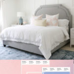
They tastefully used Benjamin Moore ‘Simply White’ on the walls in the family room and kitchen (as well as a few other rooms) at the showcase home.
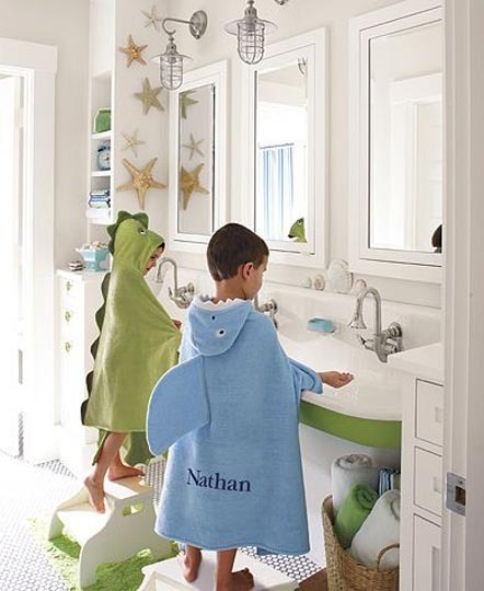
via Young House Love
via Young House Love
via Young House Love
I liked it! It reminded me of the Sherwin Williams ‘Restful White’ I have in my family room but even lighter.
I took note and didn’t think about it again for awhile.
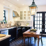
Then ‘Simply White’ popped back up on my radar in 2015 when I saw my new designer crush, Shea from Studio-Mcgee, using it on the walls in her design spaces!
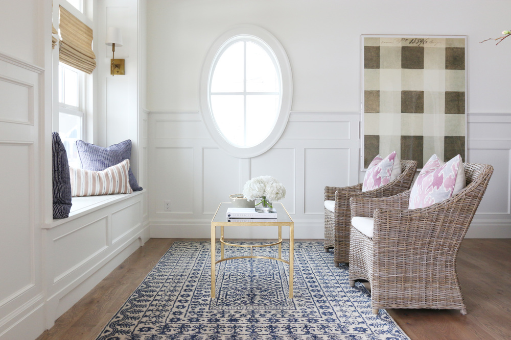
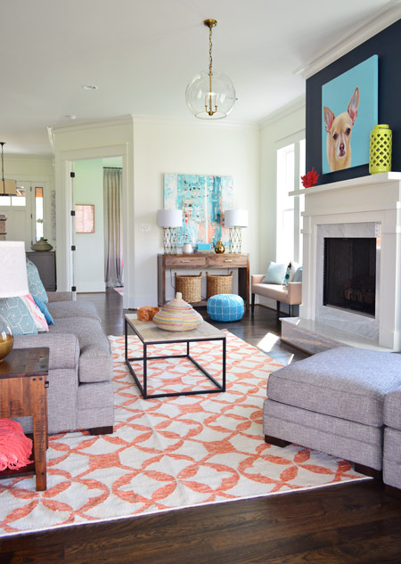
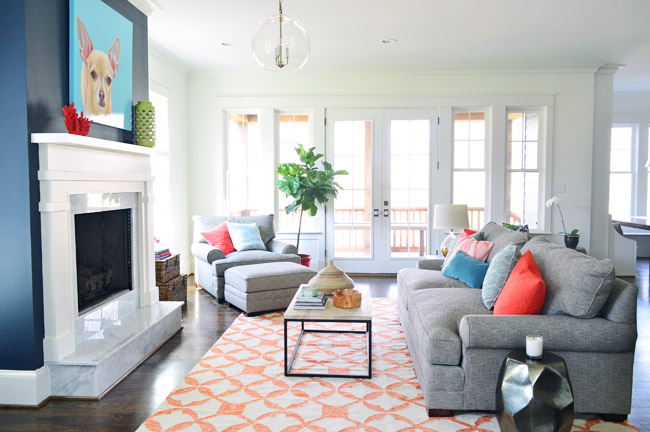
via Studio Mcgee
via Studio Mcgee
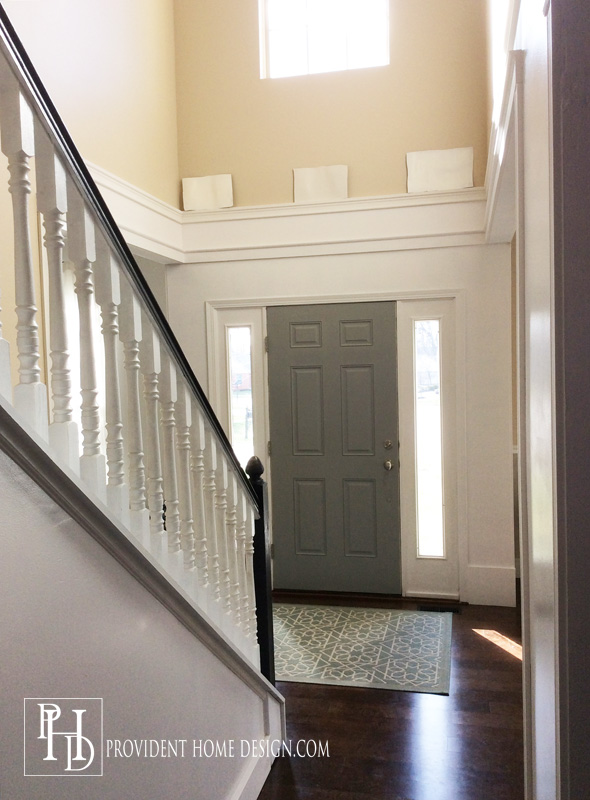
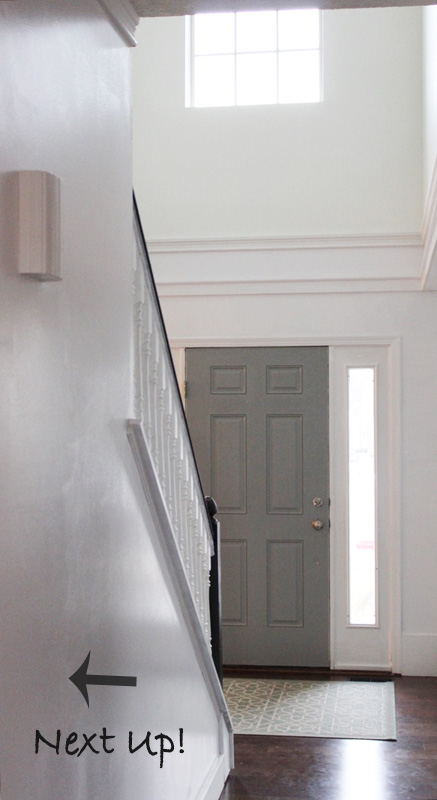
So when it was finally time for me to paint our two story foyer and “new” living room Benjamin Moore ‘Simple White’ was certainly a contender.
Pictured above is from left to right BM Swiss Coffee, BM Classic Gray, BM Simply White (Benjamin Moore sure does have unfortunate initials, eh)?:-)
After employing my tried and true technique for picking paint colors I settled confidently on ‘Simply White’ (well as confident as you can be when picking a paint color for a 2-story space…not a space you can easily do over again if you don’t like it)!
And I love it!! But is Benjamin Moore ‘Simply White’ for everyone?? Probably not.
Here are some characteristics to consider before painting your walls (or cabinets, furniture, or trim) ‘Simply White’.
1. Very rarely is a paint purely one color. As with almost all paint colors there will be an undertone (hint of another color coming through).
For ‘Simply White’ the undertone is yellow and at times a tiny bit green.
Not everyone likes the color yellow. I am drawn to pale yellows so this worked out well for me.
2. ‘Simply White’ is not a true white. Because of it’s pale yellow undertones it is a very warm white. If you are looking for a true, standard pure white do not choose this one. However, if you are look for an off-white that gives off a lot of warmth this is good choice (no harsh, hospital vibes with this white).
3. ‘Simply White’ glows. Okay so paint may not really be able to glow but I swear it looks like it glows. 🙂
If you don’t want your walls to radiate this paint color may not be for you. Living in Ohio where sunny days are few and far between I love the warm glow of ‘Simply White’! However, I don’t think everyone would appreciate it
‘Simply White’ is especially useful in rooms with no windows or perhaps north facing rooms that get little sunlight because the paint color itself resembles light (I swear it glows)!
4. ‘Simply White’ will create a light and airy space. It is important to know if you use Simply White the overall general feel of the room will be light and airy and perhaps a bit whimsical. If you are designing a moody man cave or a dramatic dining room this is not going to be “right” paint color.
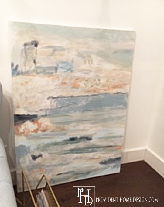
I think if you were even to add a dramatic black and white abstract painting (like the ones I discussed here) you would still end up with a light and airy feeling room!
5. If you have a collection of artwork or a colorful decorative souvenir you want to showcase in your space then paint the walls ‘Simply White’. ‘Simply White’ really compliments artwork and the use of other colors in the room.
Perhaps it’s the perceived light that ‘Simply White’ gives off that makes it act as a spotlight to the other colors and features in the room.
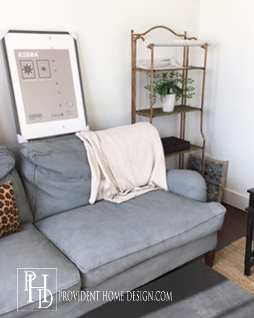
Below is an abstract painting I created for my friend Lolly’s Master Bedroom that we are slowly making over. I took a picture of it in my living room up against the ‘Simply White’ walls before taking it over to her house (Here is my tutorial on painting your own no fail abstract paintings).
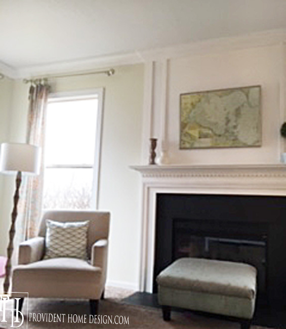
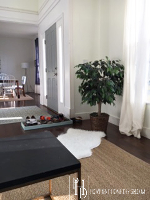
For those who are new here I recently turned my dining room into my living room and my living room into my dining room. I’m so glad I took the plunge and made the switch…it make a lot more sense this way!
I’ve been slowly working on the “new” living room. I took the chair rail down and painted the room Benjamin Moore ‘Simply White’.
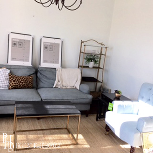
But the room is still definitely trying to figure out what it wants to be when it grows up.
We will see! I hope after reading this post that you feel you have a better handle on Benjamin Moore’s 2016 Color of the Year ‘Simply White’. As well if you would want to use it in your home or not!
If you are interested here are some more of Benjamin Moore’s color trend predictions for the year.
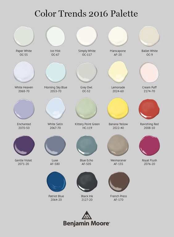
via Benjamin Moore
Have you used any of these colors in your home before?? There are some really pretty ones!! Have a great weekend and as always thanks for being here!!:-)

You can follow along at Pinterest/Instagram/Bloglovin/RSS