Pantone is a corporation which dictates the standard language for color communication from designer to manufacturer to retailer to customer worldwide.
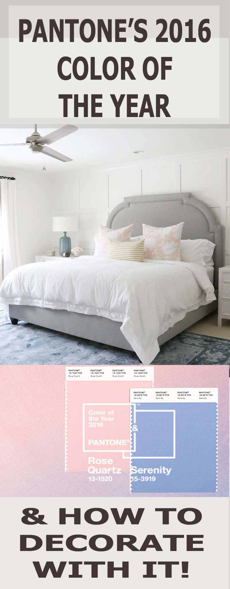
Traditionally Pantone determines one color for the upcoming year that they believe will trend in graphics, fashion, and home decor. However, this year for the first time ever they chose two! The 2016 color(s) of the year were recently announced to be (drum roll please), “Rose Quartz” and “Serenity”.

I was lucky enough to have Randal Weeks, founding designer of Aidan Gray, a leading brand in home furnishings, weigh in on Pantone’s 2016 Colors of the year!
Provident Home Design:
This is the first time that Pantone has chosen two colors to be the Pantone color of the year. Do you get the idea that they have to be paired together to achieve the look they describe as “Balance” or can you just use the pink or just the blue and still get the look?
Randal Weeks:
As a designer, I would never see myself recommending the use of these two colors together. Though their tonality is balanced, the two simply do not lend themselves for use with a long-term palette. Together they are often “sweet”. However, pairing them individually with grays, browns, whites and even camel creates dramatic timeless looks that will stand the test of time.
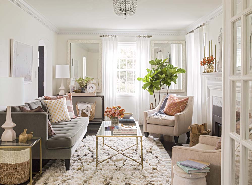
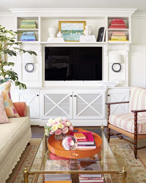
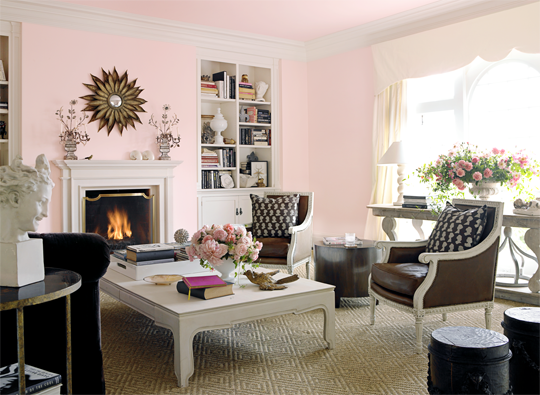
via Design Sponge
Provident Home Design:
Pastel pinks and blues were popular in decades past, what advice do you have for using these colors without the space looking outdated?
Randal Weeks:
Balance them with bolder color choices, like sophisticated grays, deep rich browns or even camel. When used in a balanced way, the color will act as an accent, softening the coldness of darker pairs, adding light and warmness to colder more vibrant richer colors.
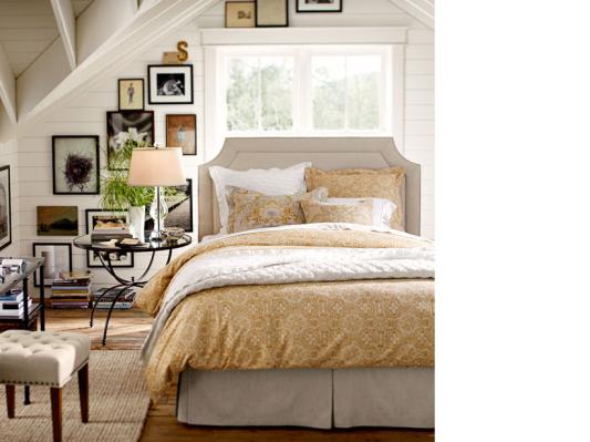
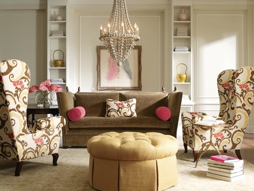
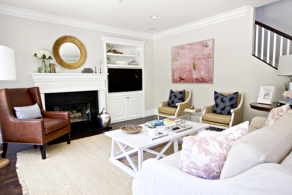
 via Decorpad
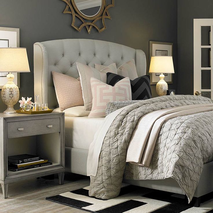
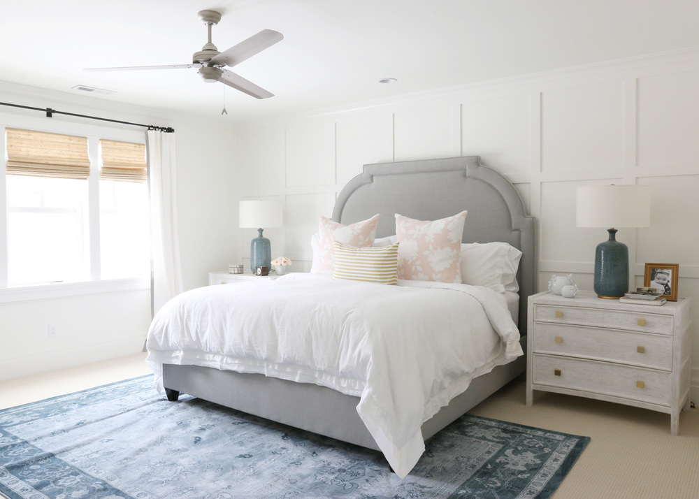
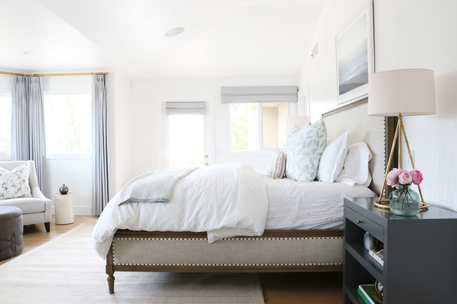
via Studio Mcgee
Provident Home Design:
What colors or patterns go well with rose quartz and serenity?
Randal Weeks:
Rose Quartz pairs well with raven, rich cool grays, crisp whites and is a perfect fit with a camel color. Antique bronze, gold and warm nickel would allow the color to truly pop against the metallic finish.
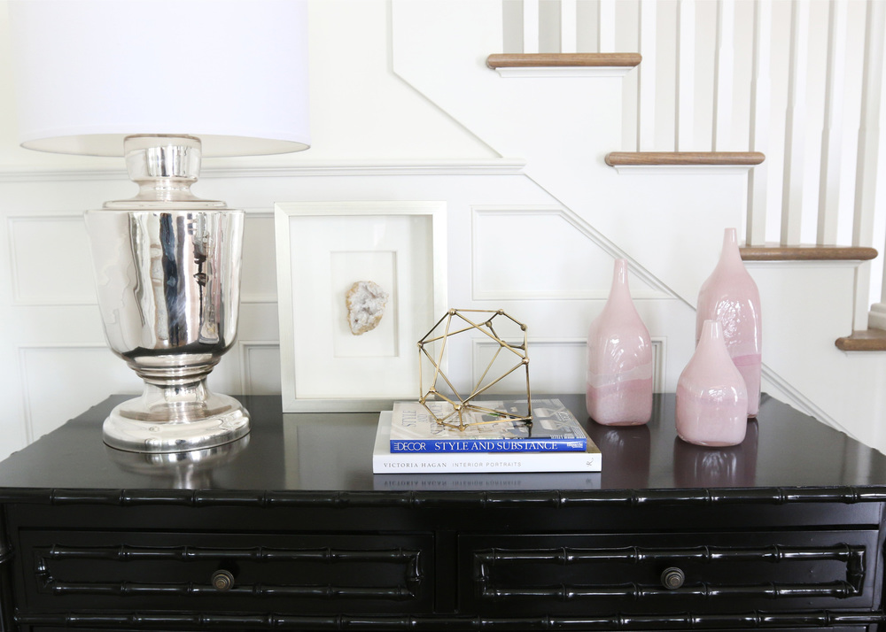
via Eddie Ross
The color pairings for Serenity are very much the same as Rose Quartz, hence the selection of them as a PAIR for 2016. But on the metal fronts, I would recommend Gunmetal & bright Nickel.
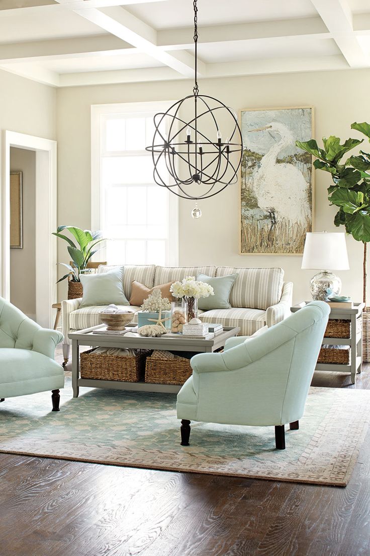
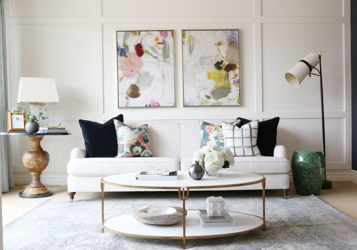
via Studio Mcgee
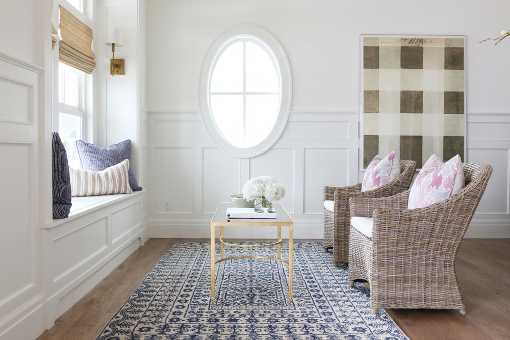
via Studio Mcgee
Provident Home Design:
Do you have any other advice for decorating with Pantone’s 2016 color(s) of the year?
Randal Weeks:
When using color, I have two schools of thought. Either use it in a big way, meaning the whole room and ground the rest of the room with balance colors to neutralize the influence.
via Benjamin Moore
Or use it as pops, repeating it 3 times in the room, in various shades to create a layering in of the accent. You never want everything to match, so your base color and then tones of it, layered give you the most timeless and effective use of the featured color.
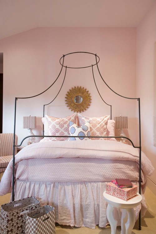
via Studio Mcgee
via Studio-Mcgee
Thank you to Randal from Aidan Gray (they have beautiful furnishings and decor by the way):-) for his insights on successfully incorporating ‘Rose Quartz’ and ‘Serenity’ into our decorating scheme this year. I think his suggestions are right on target!
I am definitely drawn to the rooms that use the soft pinks or blues as an accent rather than as the center stage color. How about you?
via Studio McGee
I have always been drawn to all shades of blue (my favorite color) but lately pinks have also been on my decorating mind (hence my pink and gold Christmas décor).
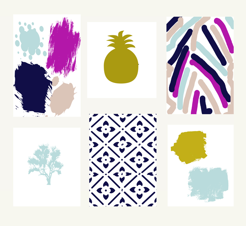
For fun I’ve put together a little mood board of budget-friendly home decor incorporating ‘Rose Quartz’ and ‘Serenity’ for anyone who is dying to jump on the bandwagon!:-)
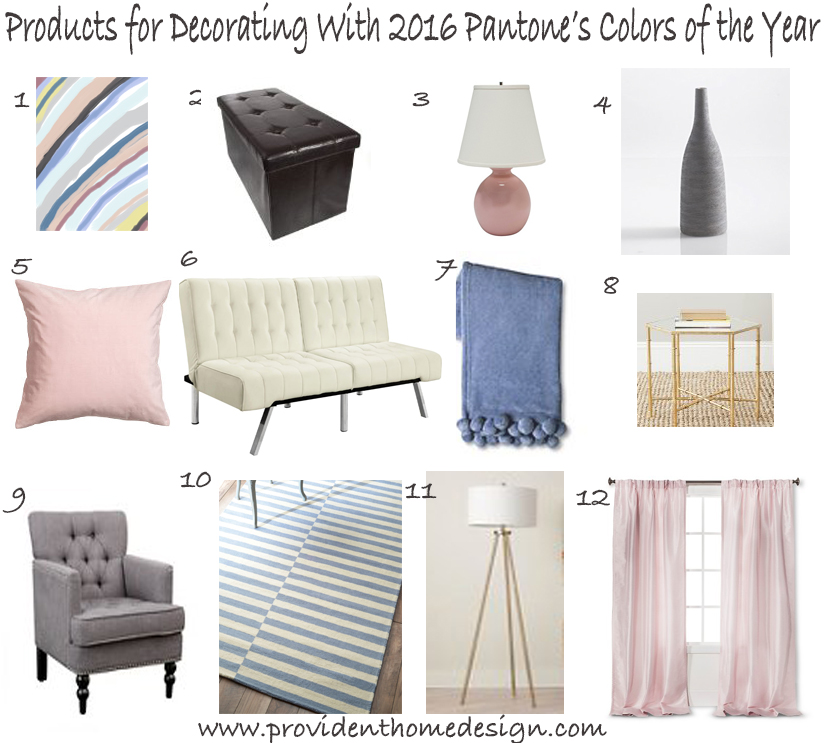
1 (see below*)/2/3/4/5/6(or this)/7/8/9/10/11/12
***1-As an early Christmas present you can download and print this printable for free until the end of December, HERE.:-)
Also based off of Randal’s interview I put together a palette of paint colors that work well with the Pantone’s colors of 2016.
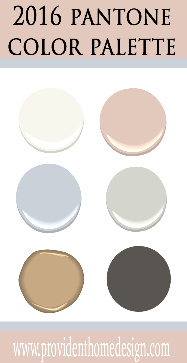
Benjamin Moore Simply White, Benjamin Moore Odessa Pink, Benjamin Moore Violet Mist, Benjamin Moore Gray Owl, Benjamin Moore Camel Hair, and Sherwin Williams Urbane Bronze.
I hope you enjoyed learning more about Pantone’s color(s) of the year for 2016. I’d love to hear what you think! Hate it? Love it? Or just okay? Let me know what you think in the comment section!
I hope you have a great rest of your week!!:-)
Related Posts From the Blog:
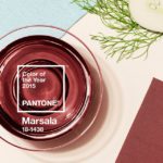 Pantone’s 2015 Color of the Year
 Is Gray Here to Stay?
 Navy & White You Feel So Right
 Interview with Tori Toth: Home Staging Secrets for a Quick Sell
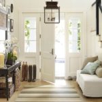 I’m Dreaming of a White Entry
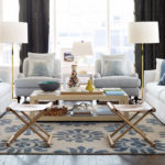 Design 101- How to Define Your Own Unique Decorating Style
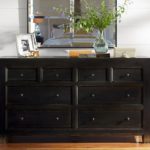 Easy Dresser Makeover + Progress in the Bedroom
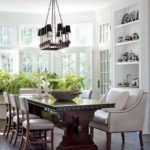 Home Decorating Goals for the New Year!