***Warning: This is a long post that will thrill those who are interested in learning more about creating color palettes for a space (or for anything for that matter). If you aren’t interested in color I’ll see you back next week!!:-)
When decorating a room, color rarely takes a backseat! In fact choosing a color palette is usually one of the first tasks a decorator performs.
It has been my experience that sometimes color palettes come easy. In these cases it’s like the room is screaming out to you what color the walls need to be painted and what accent colors should be used in the decor.
But then there are those times when you look at a room or space and you just can’t figure it out! Have you had those dumbfounding moments (or months) where you rack your brain with all the possibilities but nothing seems ‘right’. Or am I the only one?:-)
For those tricky times when color combos aren’t coming easily there is a free app that might help. Additionally this app has helped me learn more about color and how to manipulate it to create more attractive color palettes (because let’s face it sometimes color can be darn right elusive).
The app is called Adobe Color CC and works with iPhones, iPads, and android devices.
Here are 3 ways that this app can help you find and decide on a color palette for a space.
#1 By Finding Rooms and Spaces you Love Online and Deciphering their Color Palettes.
Before decorating a room I will often look online at Houzz or Pinterest for inspiration. With this app you can decipher color schemes in room that you love and then use them in your own spaces.
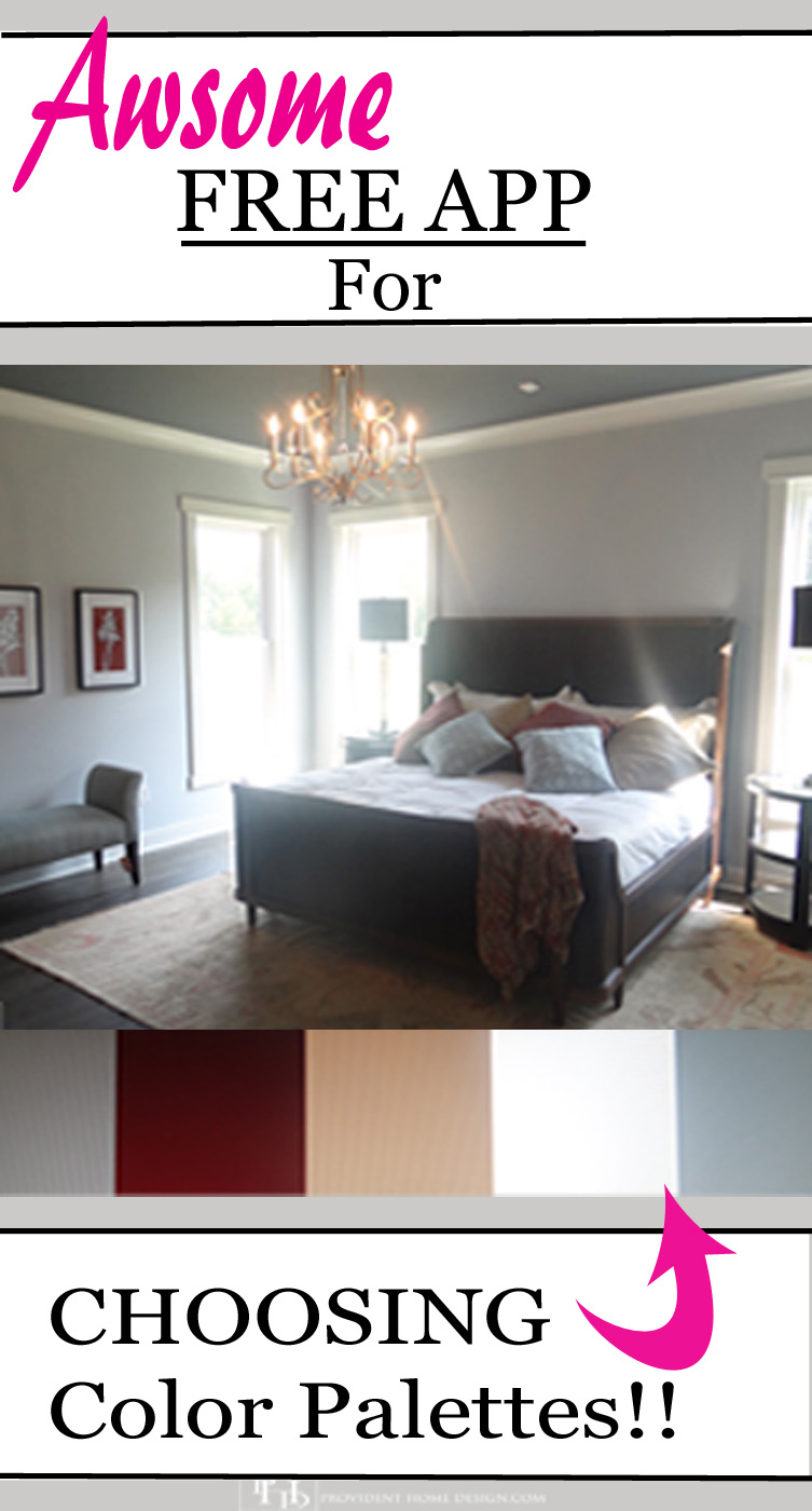
For example, below is a kitchen that I adore. After saving the image on to my tablet I was able to pull up the color palette used in the room.
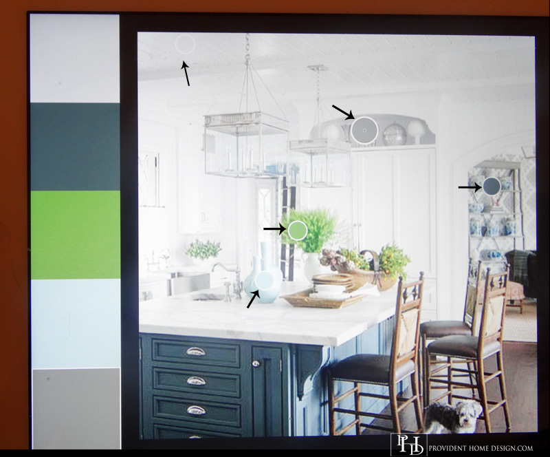
After getting the color palette I could then replicate the color scheme in one of my own spaces by choosing one of the colors for a wall color and another as a feature color and the rest as accent colors to use more sparingly throughout the room.
If you want a lighter more airy, calm feel to the room choose the lightest or most neutral color in the palette for the wall paint. It you want a more dramatic or energetic space choose a darker or brighter color in the palette for the wall color.
When you click on the color there will be a number come up above it. The number is it’s Pantone or hex code which if brought into Lowes or Sherwin Williams (and I think Home Depot too) can be matched to a paint color.
Do you have an inspiration photo online you want to replicate, here is step by step of how to do it (I would suggest skipping to #2 unless you are ready right now to do it)!
First, press down on your inspiration photo and click ‘save image’ to save it to your mobile device. If you are on a desktop you can save the image to your desktop and then email the image as an attachment to yourself. Then later when you are on your mobile device you can get the image from your email and save it to your device.
Once the image is on your mobile device click on the Adobe Color CC App.
![]()
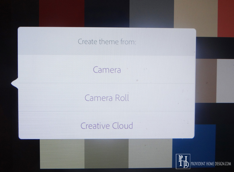
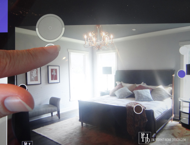
Tap the plus sign on the left side of the screen
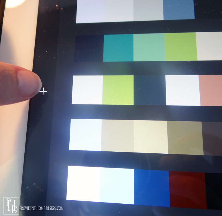
An option bar will come up, choose ‘Camera Roll’.
Then choose ‘All Photos’ and find the inspiration photo you saved and tap on it.

Immediately the photo will pull up and 5 circles will quickly move around the photo and then stop. When they stop a color palette will appear on the left side of the screen.
Locate where the 5 circles stopped (this is where the colors on the left are being pulled from). With your finger move the circles to the parts of the room you feel are most indicative of the space.
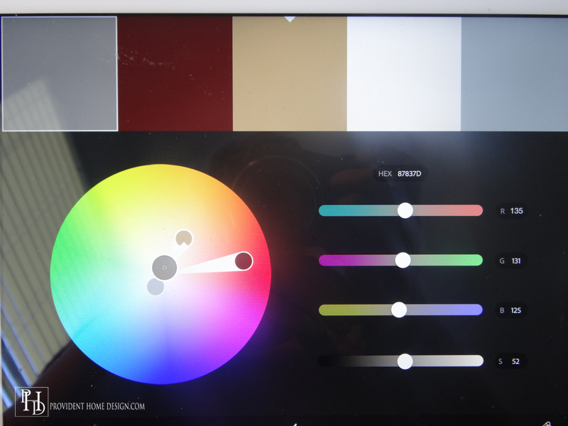
After moving the circles around I came with the below color palette to represent the color scheme of my inspiration room.
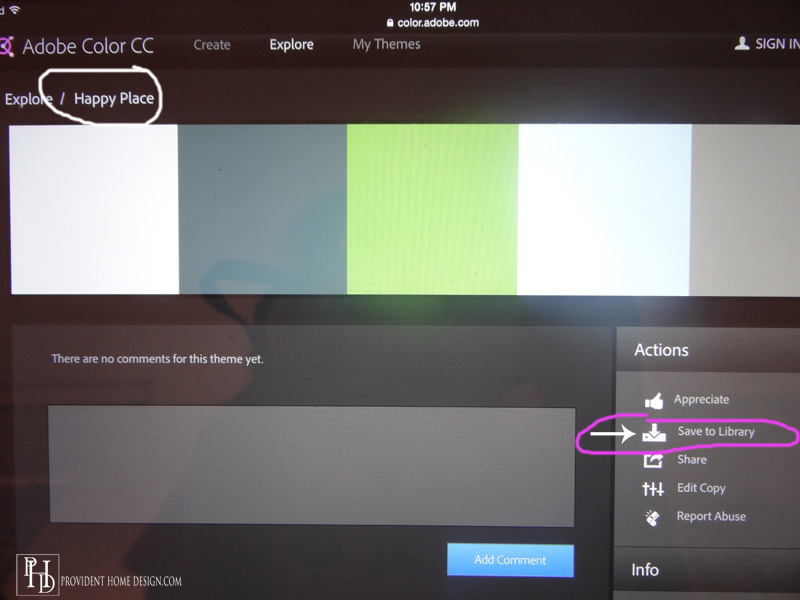
You will then be able to name and save the color palette to your library as shown below.
#2 The Adobe Color CC app can help you finish off a room you’ve already started.
Do you ever know what color you want to paint the room but then don’t know what to do next. Or maybe you have some decor items and the wall painted but don’t know how to finish the room out?
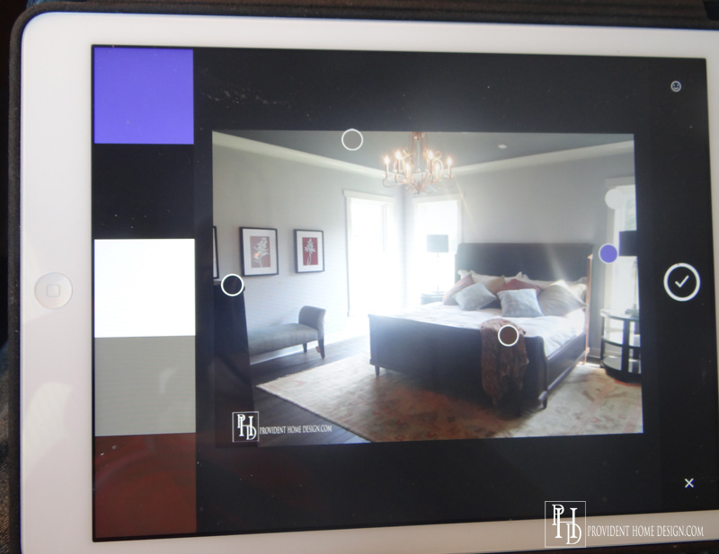
The app can come in handy in this situation too. You can take a picture of the space with your phone or tablet’s camera and then pull the photo open in the app.
It will show you what colors you have already going on and then after you save the palette to your app’s library you can go in and edit it.
At this point you could experiment with different color options until you find a color palette combo you love.
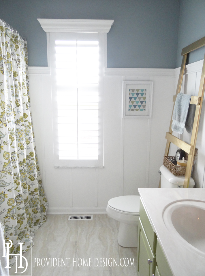
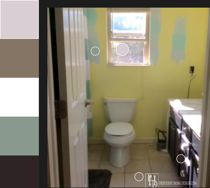
For example, I did this recently for a friend’s bathroom. She had wanted a bright, airy feel to the room and so she a painted the bathroom a bright yellow and hated it! She didn’t know what direction to go next.
We took a picture of her bathroom and found the current color palette on the left side.
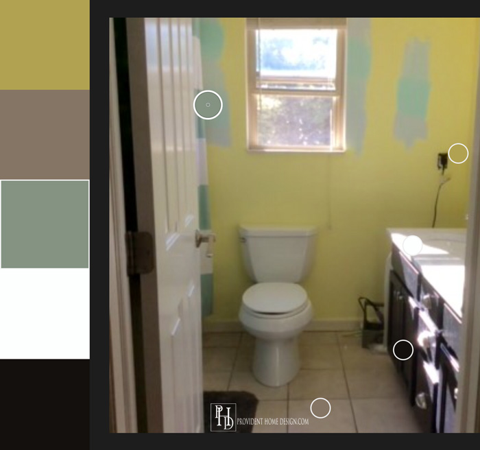
She knew she only wanted to change the paint color of the walls so we played with the top color representing the wall. We first tried a light gray. The colors looked good together but the color combo had an overall cool feel to it, not as cheerful as she wanted.
So we changed the top (wall paint) color to an off white with a warm undertone. It looked great together and gave a more balanced, pleasant feel. It also had similar tones as the flooring and so will give the illusion of a bigger room because of the continuous flow of color.
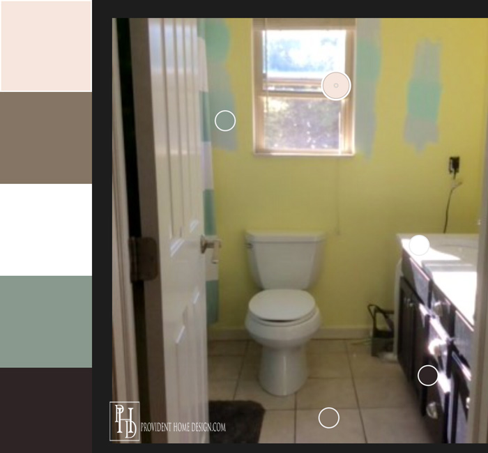
She plans on adding a splash of color and fun in a simple wall decor piece. I felt the app was very useful for this kind of situation!
#3 By Exploring the Color Palettes others have created with the app.
When you create color palettes and save them to your library you can choose to keep them ‘secret’ or to ‘share’ them.
When a person shares a color palette it goes into a section called Explore where people can view all the shared color palettes.
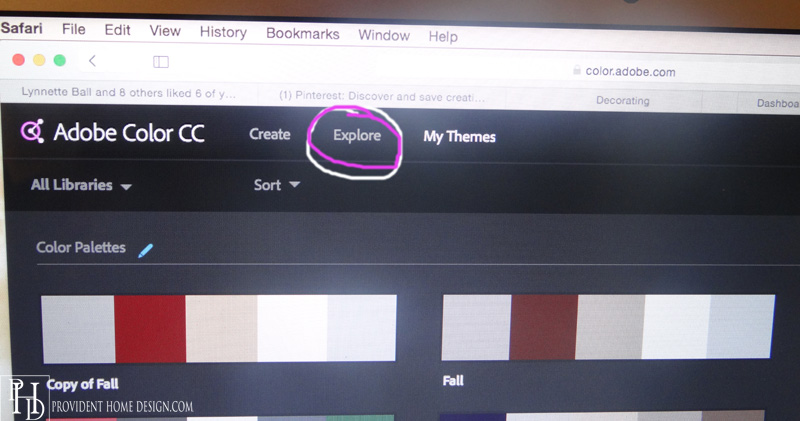
If you like one (or 2 or 100) of them and want to save them to your own library you can easily do so.
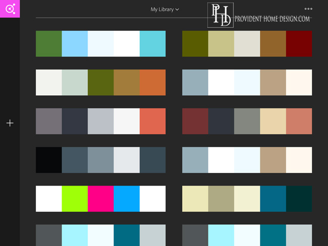
Here are some examples of color palettes I found in the Explore section created by others.
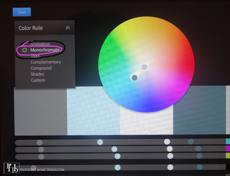
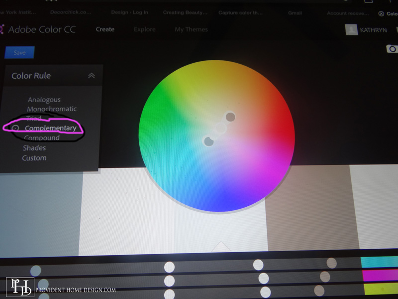
Lastly I’ve really enjoyed playing around with the interactive color wheel on the app. When you go into edit a color palette there is a color wheel and some sliders. When you move the color sliders around, it will show you where the change of color is happening on the color wheel.
There is also a ‘Color Rule’ Dropdown box where you can take a color palette and see how it changes from ‘Monochromatic’ to ‘Complimentary’ to ‘Triad’ as shown below.

Color is a powerful tool and change a space like no other design element! It has been fun and helpful experimenting with it in this app (thanks, Mom, for telling me about it).;-) I hope you enjoyed learning about this free app and if you have any questions I’ll do my best to answer them!
If you are interested in learning even more about color Here is my post about balancing warm and cool colors and a fantastic decorating color wheel tutorial, Here.
As always thanks for being here and feel free to share this post with others if you think they would like it! I hope you have an enjoyable weekend!!:-)

[jetpack_subscription_form]
Follow me on Pinterest and Instagram for more decorating ideas and inspiration!