I was so focused on finishing up my boy’s room and too excited to share it with you that I neglected to post a Design 101 for the month of July! So here it is a week later. The past few Design 101s have discussed methods of creating balance in a room or space. Today we will continue that conversation with regards to the balance of warm and cool colors in a space.
Warm colors include the colors red, orange, yellow, and perhaps brown (a warm neutral). Cool colors are thought to include blue, green, purples and often gray (typically a cool neutral). Whites can be warm or cool dependent on what undertones are used.

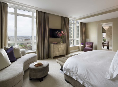
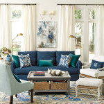
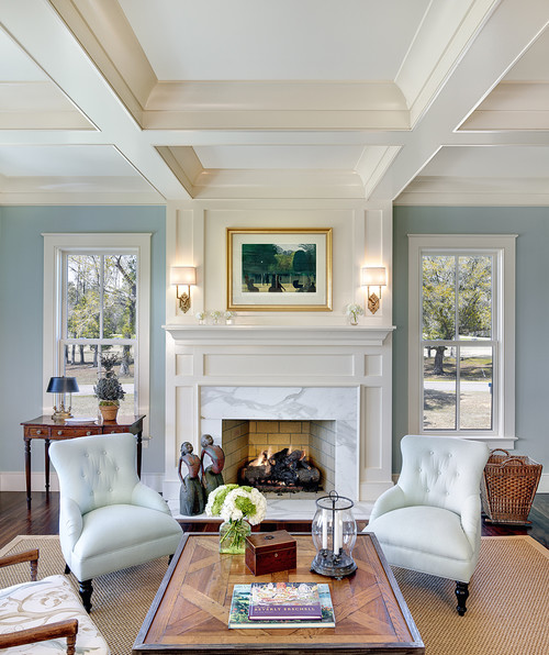
Cool colors are often associated tranquility however if used in it’s brightest hues like turquoise or apple green the colors shout vitality and energy. Too many cool colors in a room can make a space feel cold and unfriendly. Although, I like the room below I feel it could benefit from a few more warm toned accents.
Likewise too many warm colors in a room can make the space feel closed in or drab.
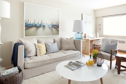
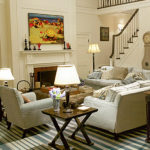
It is best to have a mix of warm and cool colors in a space to provide a feeling of balance to the room. If you have a preference for warm or cool colors that’s okay just make sure to add at least a few items in the opposing set of colors. I love the combination below–blues and grays with a punch of orange and a touch of brown to balance the cool colors.

via HGTV
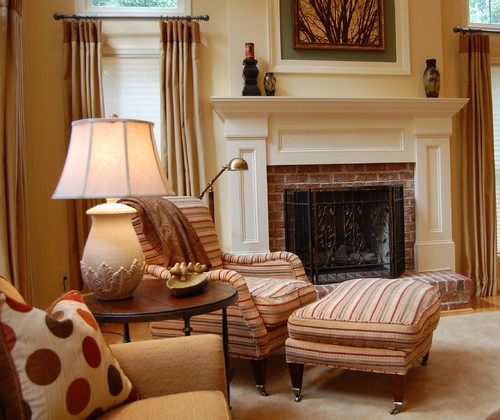
Finishes can also give off a warm or cool tone. For example gold finishes used in frames, hardware, lighting etc. read warm and chrome and brushed nickel read cool. Rubbed oil bronze reads pretty neutral to me.
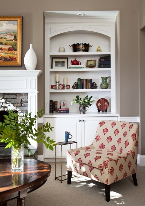
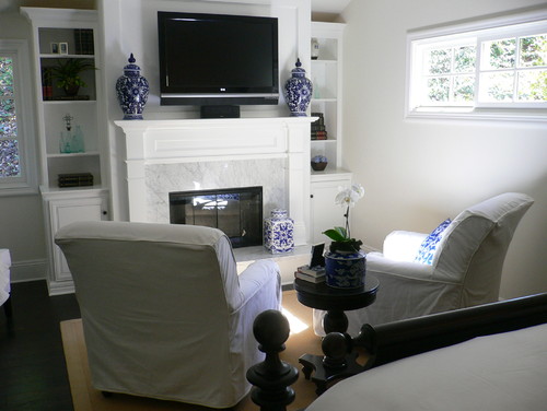
You can observe in the photo below how much warmth the gold accents above the mantle radiate in the room.
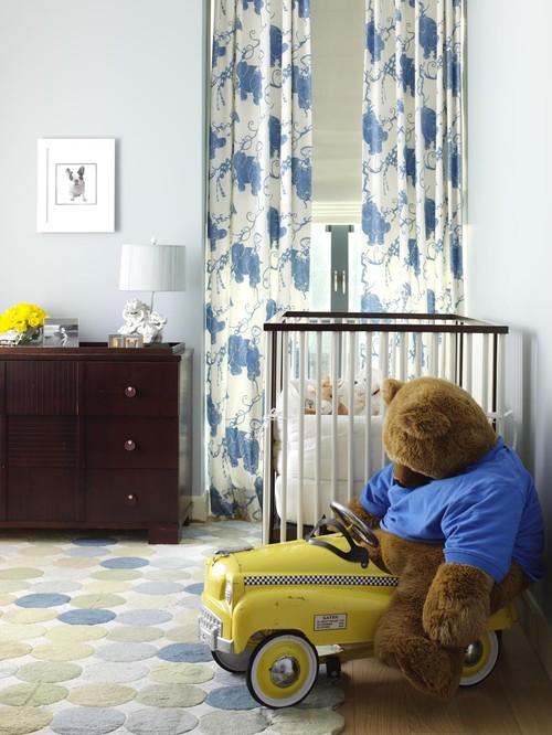
I personally gravitate towards cool colors and love to use yellows to balance out all my blues and greens (like below)