Last month we discussed the design element of flow as it pertains to the functional flow of a space. In this month’s Design 101 we will explore flow with an emphasis on aesthetic flow, or in other words, how easily the eye can move throughout a space. Good flow allows the eye to move effortlessly. Not so good flow causes the eye to have choppy movements which can leave a person feeling unsettled or disoriented.
First, I want to get something out on the table. Not everyone is as visually sensitive or affected by their surroundings as others. Take for example my husband who states he isn’t affected at all by what his surroundings look like. I on the other hand am very affected by my visual surroundings and I seek out spaces that feel peaceful and tranquil. Good flow helps create that peaceful, inviting indoor landscape.
Much of what makes a home feel visually cohesive is the repetition of color. Does this mean you have to paint the inside of your house all the same color? Nope, not at all!
What you can do is stick to a maximum of 3 or 4 colors (you can use any varying shades of those colors) and use them throughout your home. Soft whites and off- whites (as well as very pale colors) are easy on the eye and can be employed in any room (they don’t count as one of your 3-4 colors).
The most important thing to remember in creating visual flow in your home is that if you use a color in one room (with paint or accent pieces) make sure you have at least some of it in any of the adjoining rooms. See below how Lauren Leiss, interior designer extraordinaire, exemplifies this principle as she takes the bold hallway color and visually connects it to her clients bedroom by adding a pop of the same color in the bedside lamp.
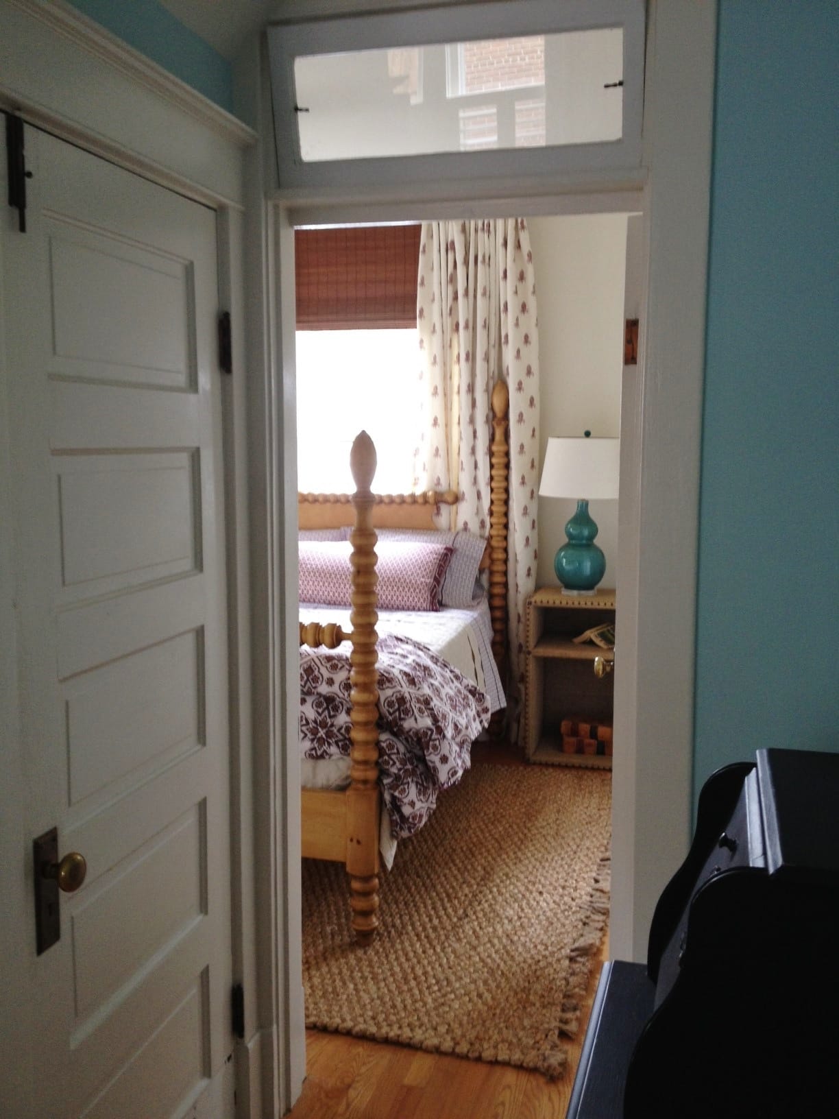
Via Lauren Liess
Try looking at the picture and imagine the room without the lamp (you may have to put your hand up to the screen to cover it). If the color was not continued into the bedroom in some way the aesthetic flow would not be there and the space would feel more choppy and disjointed.

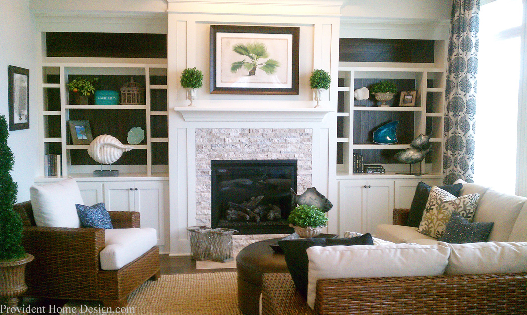
Observe how well the home above flows across three areas (two rooms and a hallway). The three colors used throughout these spaces are blue, green, and brown. In the closest room varying shades of blue are used in the rug, in the decorative bowl, and in the lamps. Blue is carried into the next room as well. Can you spot where? Yep, it is on the ceiling.
Green is displayed in the rug as well as a backdrop to the stencil on the wall. Then it is employed in the next room in the chair colors and paint color on the wall. It is continued into the hall way as a backdrop to a new stenciled wall. The last color utilized to tie these three spaces together is brown. It can be found in the rug, in the stencil on the wall, in the decorative bowl, and on the bases of the lamps. In the next room brown is repeated in the chair legs and table and then continues into the hallway will another stencil.
Personally, it is easier for me to create flow by keeping hallways and foyers in an off white or very pale color since they are usually connected to several rooms. This way they act as a transitioning buffer as the eye move from room to room. It’s like when painting, before you start using a new color you clean your brush off in water. Likewise a soft neutral color can clean off the eye as the eye moves to a room with a different color scheme.
Our upstairs hallway is connected to 5 different rooms. From the hallway you can see into my sons’ room that is blue and red.

Into the Master bedroom and bathroom which are blues and tans.


Into the Nursery which boasts browns and blues (grays are can be lumped with blues and purples).

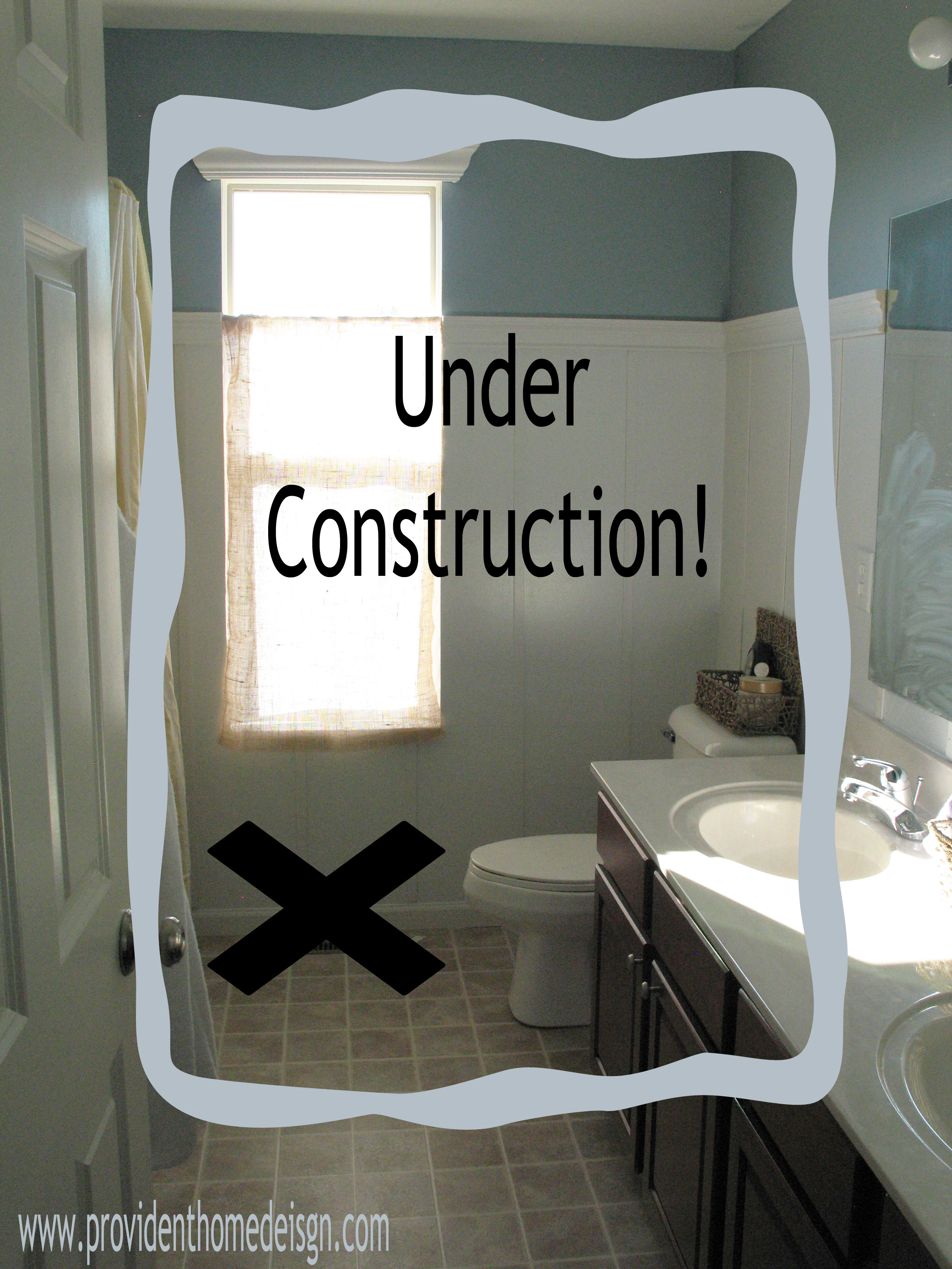
To a Kid’s Bathroom which is under construction but will primarily be blues and greens.
And to my Daughter’s Room which is mostly blues and pinks with a tiny bit of greens.

Ultimately what ties these spaces together is having the hallway that connects them a light neutral beige palette and using varying shades of blues in all of the rooms. Also believe it or not the browns, reds, and pinks I used in these rooms are actually closely related in color and can even be found on the same fan deck at times.
So in summary, when you are looking to create good visual flow in your home and spaces, stick to a maximum of 3 0r 4 colors and find ways to display varying shades of those color throughout your entire home. Remember to pay close attention to connecting rooms that adjoin. And feel free to use a light or off-white paint color as an avenue to cleaning off the visual palette when transitioning between two spaces with different color schemes.
I hope this Design 101 on visual flow has been helpful to you! If you are interested in studying a couple more homes where designers have demonstrated this principle click on the links here and here. Have a great day!:-)
Related Posts From the Blog:
 How to Paint a Bathroom Vanity like a Professional
 Love Your Kitchen Series- Adding Fabrics
 5 Ways to Save Big on Hardwood Floors & New Floor Reveal
 Christmas Home Tour
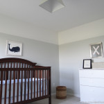 Pottery Barn Kids Knockoff Wall Art
  Benjamin Moore’s 2017 Paint Color Forecast
 DIY Exaggerated Window Casings
 Boys Bedroom Makeover Reveal